Build an exhibition in Manifest Editor
Step 1 - Accessing the Exhibition editor
Section titled “Step 1 - Accessing the Exhibition editor”The Exhibition editor is a separate workbench view within the Manifest Editor, to allow users to create and curate their Manifests for presentation. The toolset provided is more focussed to allow access to the necessary layout and behaviour properties to support the presentation. Easy access to annotate your IIIF content is also provided in this view. Each Exhibition Viewer supports different features and will read different layout and behaviour properties, labels and descriptive data added.
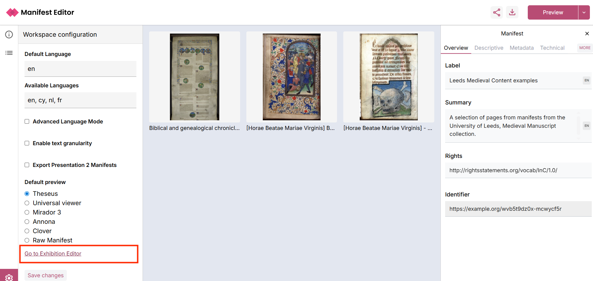
- From the Manifest Editor, when you are ready to access the Exhibition editing tools to work on the IIIF Manifest you’ve created, click on the ‘Settings cog’ in the bottom left hand menu.
- This opens the Workspace configuration for the Manifest Editor.
- Clicking the link ‘Go to Exhibition Editor’ will open your Manifest in the editor:
Step 2 - Introduction to the Exhibition editing mode
Section titled “Step 2 - Introduction to the Exhibition editing mode”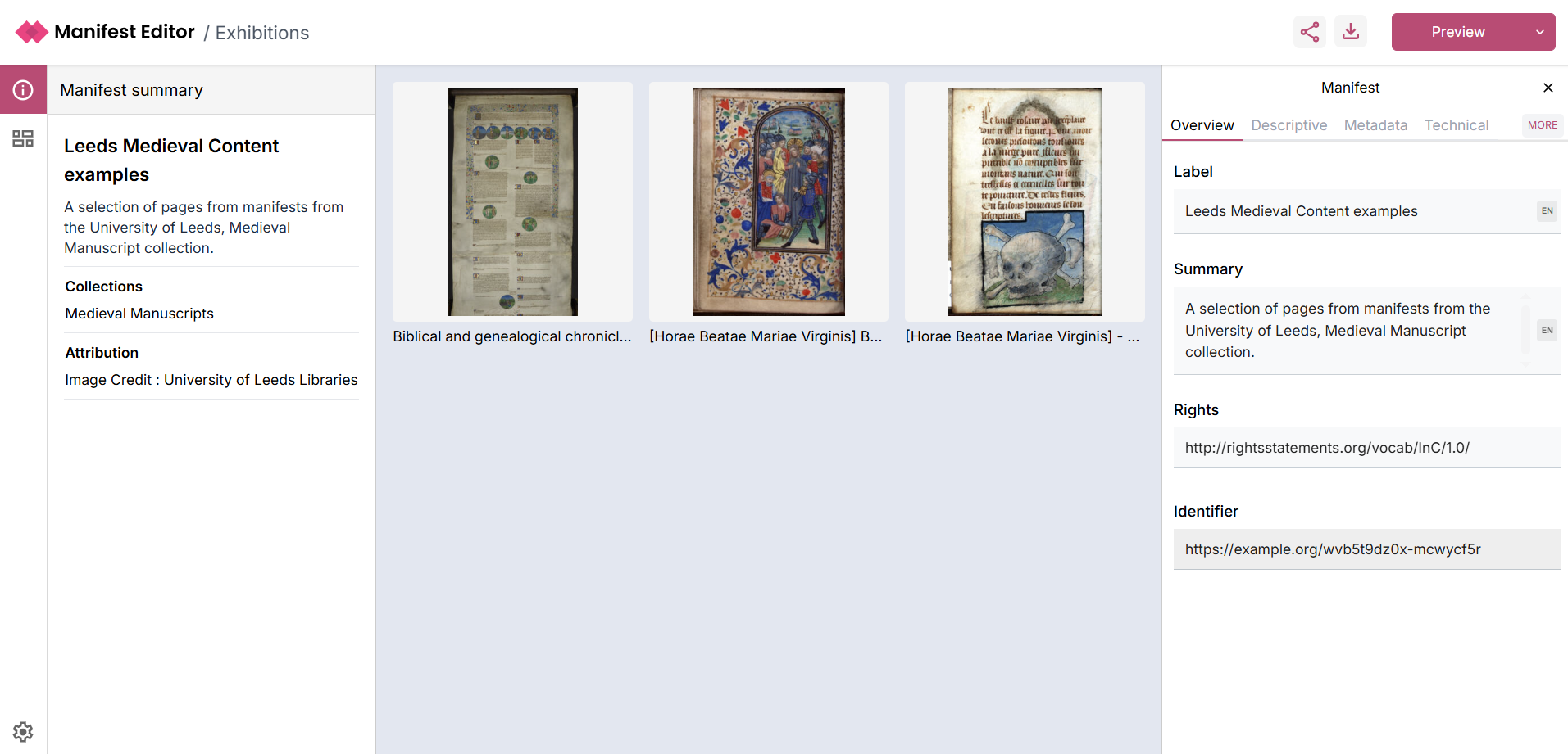
Your Manifest will open in the Exhibition Viewer as indicated in the screenshot above. The layout and structure is similar to the standard Manifest Editor view you have been using in the early activities. The Manifest and it’s Metadata properties are presented in the same way.
The main difference is how you interact with the Canvases in your Manifest, in this view.
The centre grid view presents the contents of the IIIF Manifest, whilst the right hand panel presents the Manifest metadata.
The left hand panel allows interaction with the individual “slides” (aka Canvases) that make up the exhibition. These are simply the canvases which are present in the IIIF Manifest you are editing.
Step 3 - Editing the exhibition
Section titled “Step 3 - Editing the exhibition”Clicking the Exhibition Grid icon on the left navigation or selecting a Canvas from the main panel, opens the Exhibition grid view where you can see an outline of your exhibition.
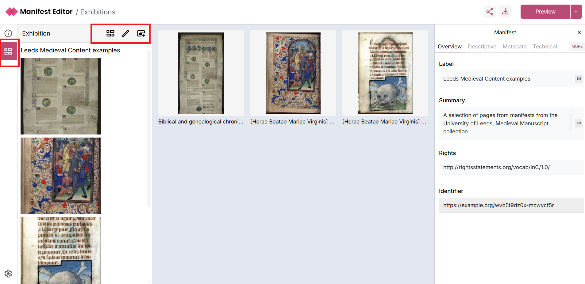
There are a number of controls:
- ‘Grid view’ which enables you to view the exhibition as a grid, essentially providing a “Preview” of the exhibition you are creating.
- ‘List view’ you can toggle the ‘Grid view’ to display the slides in the exhibition as a list.
- ‘Edit slides’ allows you to reorganise and update the order of the “slides” (aka Canvases) within the manifest. You can also remove “slides” from the manifest using the three dot menu.
- ‘Add a new slide’ enables you to add IIIF content on a new slide (aka Canvas) to your exhibition manifest.
When you click on a slide in the left hand panel (or via the centre grid view), the right hand panel presents additional exhibition specific metadata options for each slide. This panel is a custom interface which edits underlying IIIF Canvas properties.
Step 4 - Editing and updating your Exhibition manifest
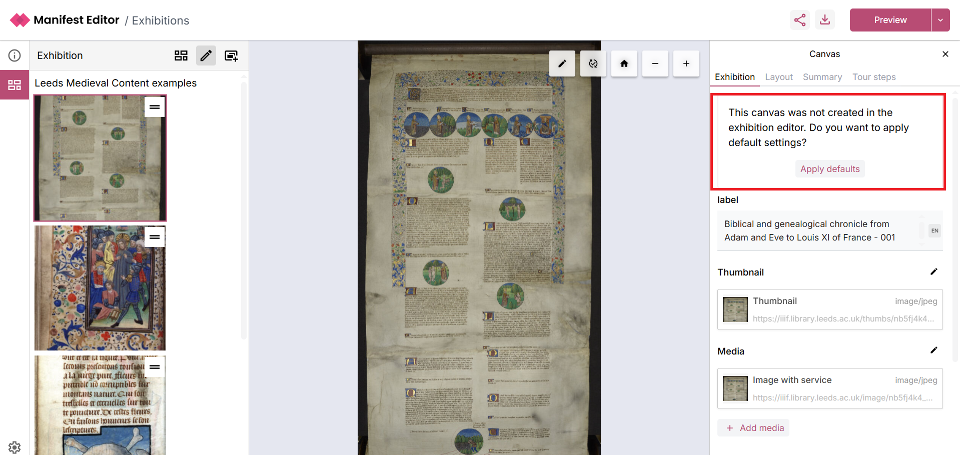
Section titled “Step 4 - Editing and updating your Exhibition manifest”As we are working with a IIIF Manifest created in the Manifest Creation and Editing step, a number of exhibition specific settings will need to be applied. These settings will determine aspects of the layout and behaviour of the exhibition manifest when viewed in the standalone Exhibition Viewer a little later.
When you click on a canvas, the right hand side metadata panel presents the Exhibition tab, which contains an option to Apply defaults which allows you to quickly select some basic layout options for the canvas based on the existing content:
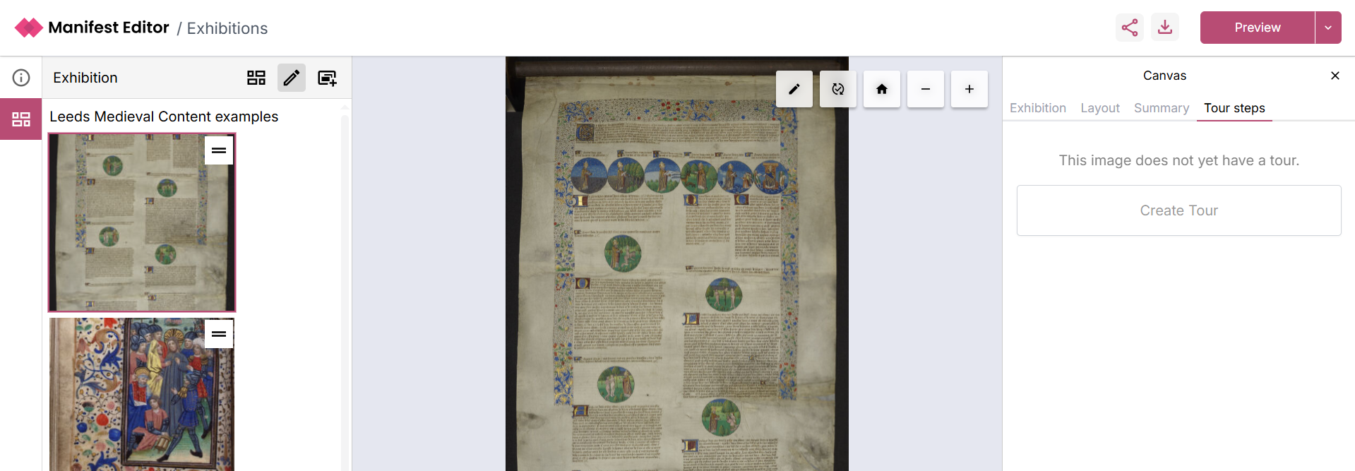
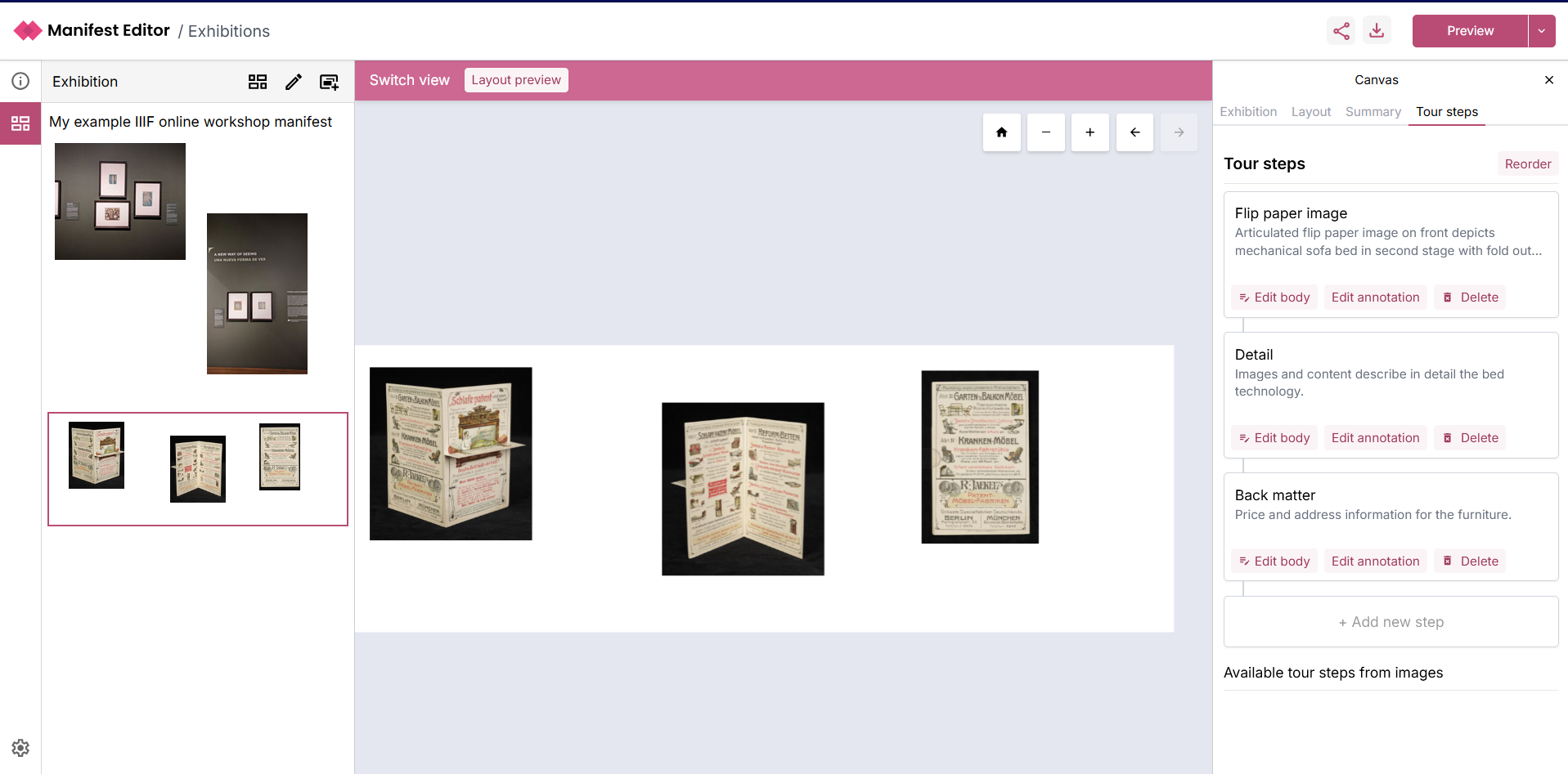
Step 5 - Creating a Tour of your Exhibition manifest
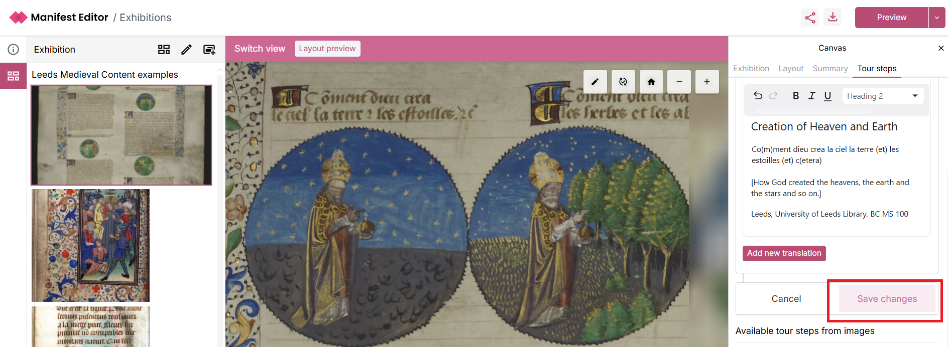
Section titled “Step 5 - Creating a Tour of your Exhibition manifest”The ‘Tour steps’ tab allows further configuration of the interaction provided for each individual slide, when viewed in the Exhibition Viewer.
Each tour step that is created is saved as an annotation, as demonstrated earlier in the presentation, these annotations can be viewed in other IIIF enabled viewers (which support display of annotation).
As you add your Tour steps, you can add a label and summary for each step, which will be displayed in the standalone Exhibition Viewer.
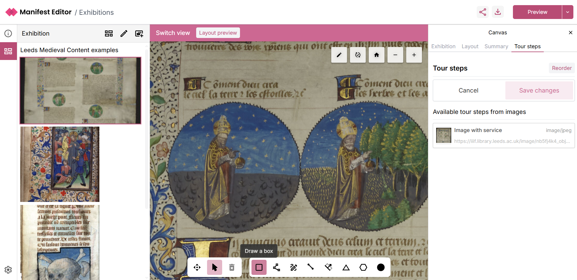
- Click to “+Add new step”

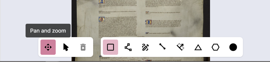
- This will load the region selector toolbar as indicated in the screenshot below. This allows you to create a region using one of the available options.

- You can click the “Pan and Zoom” button to allow you to zoom into the specific area of the content that you want to highlight.
- Pan and zoom into the appropriate section
- Then use one of the region selection options to allow you to highlight the content you want to annotate. In the example below, the box selector is used.
- When you have positioned your selection, release the selection and click the option to ‘Save’, which saves the region that you have selected.
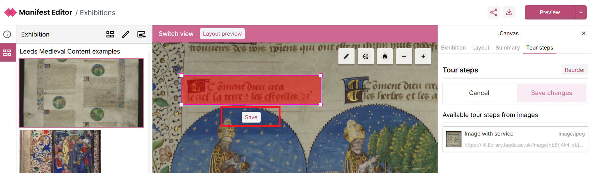
- On saving your region, you can then edit the annotation for the tour step, simply click the pencil in the right hand menu as indicated below.
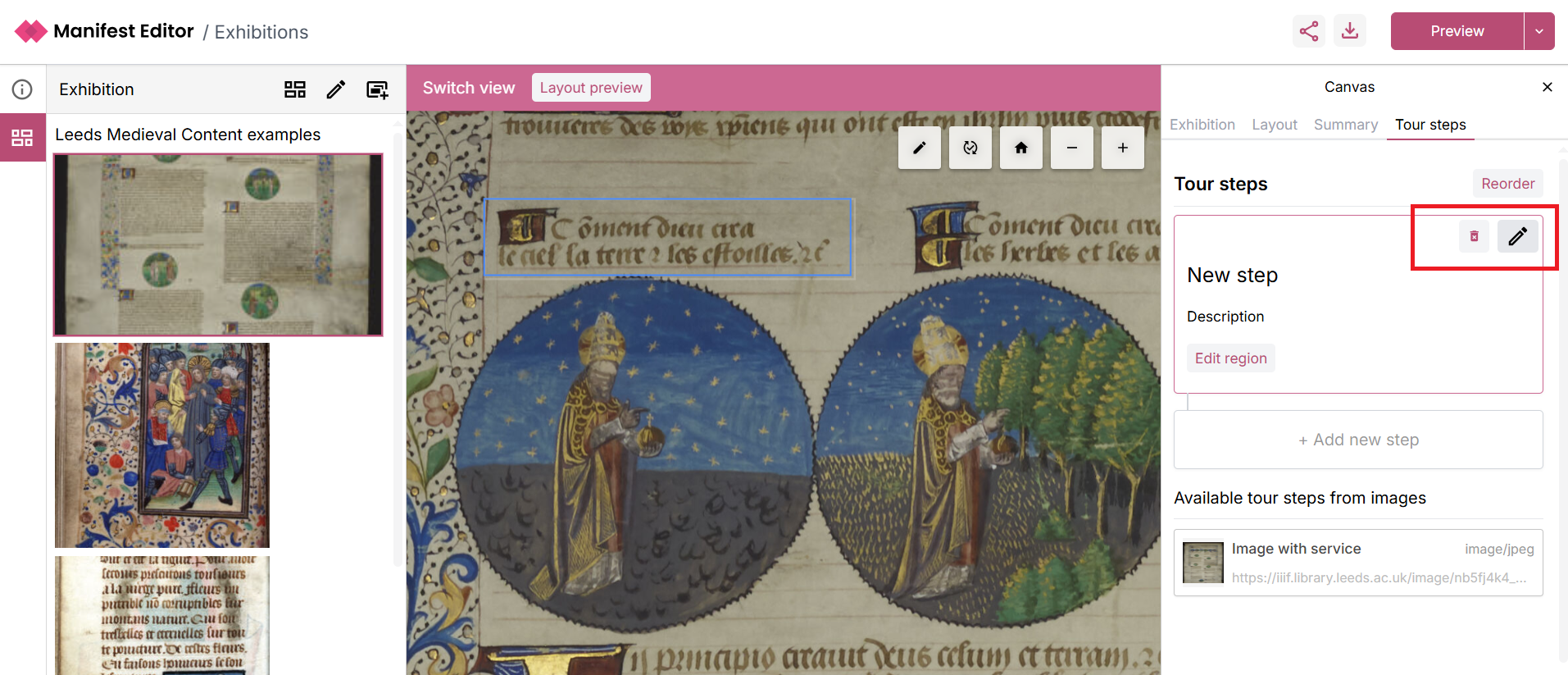
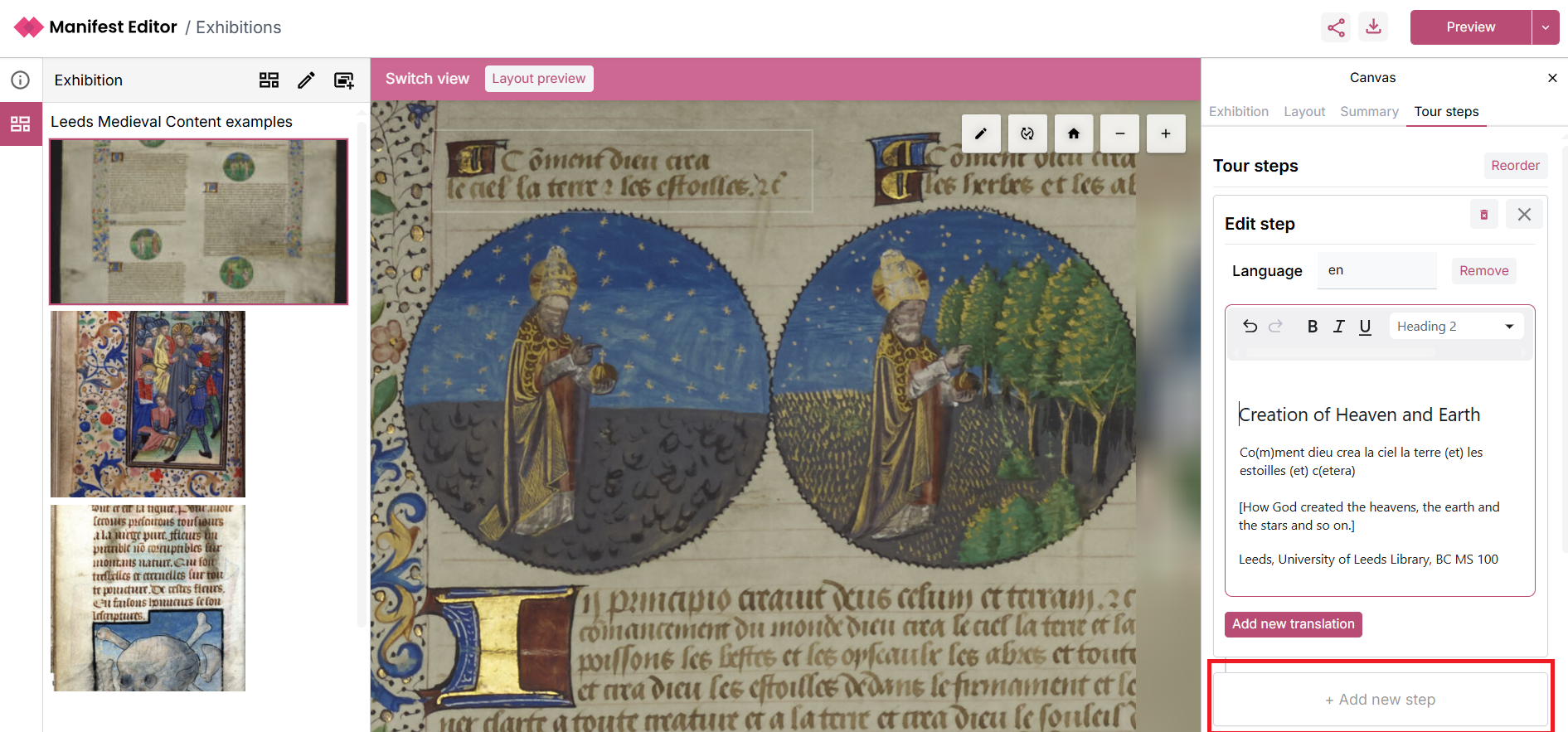
- This opens a text/html editor to allow you to edit the annotation which will be displayed for the selected region as a tour step. Add your content to the step. Use the option ‘+Add new step’ which will allow you to then save your changes.
- Click Save changes
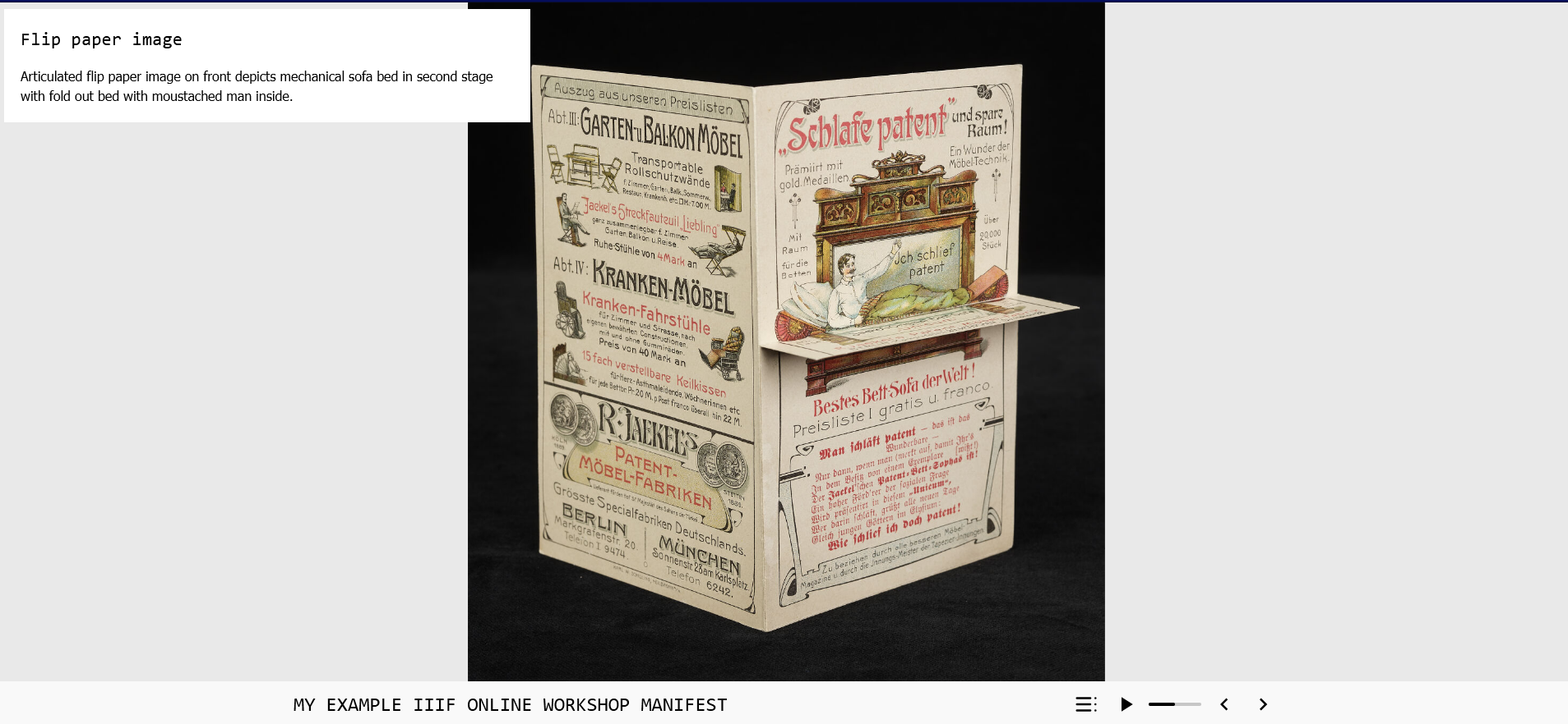
- You can now Preview your tour step in one of the Exhibition Viewer default configurations

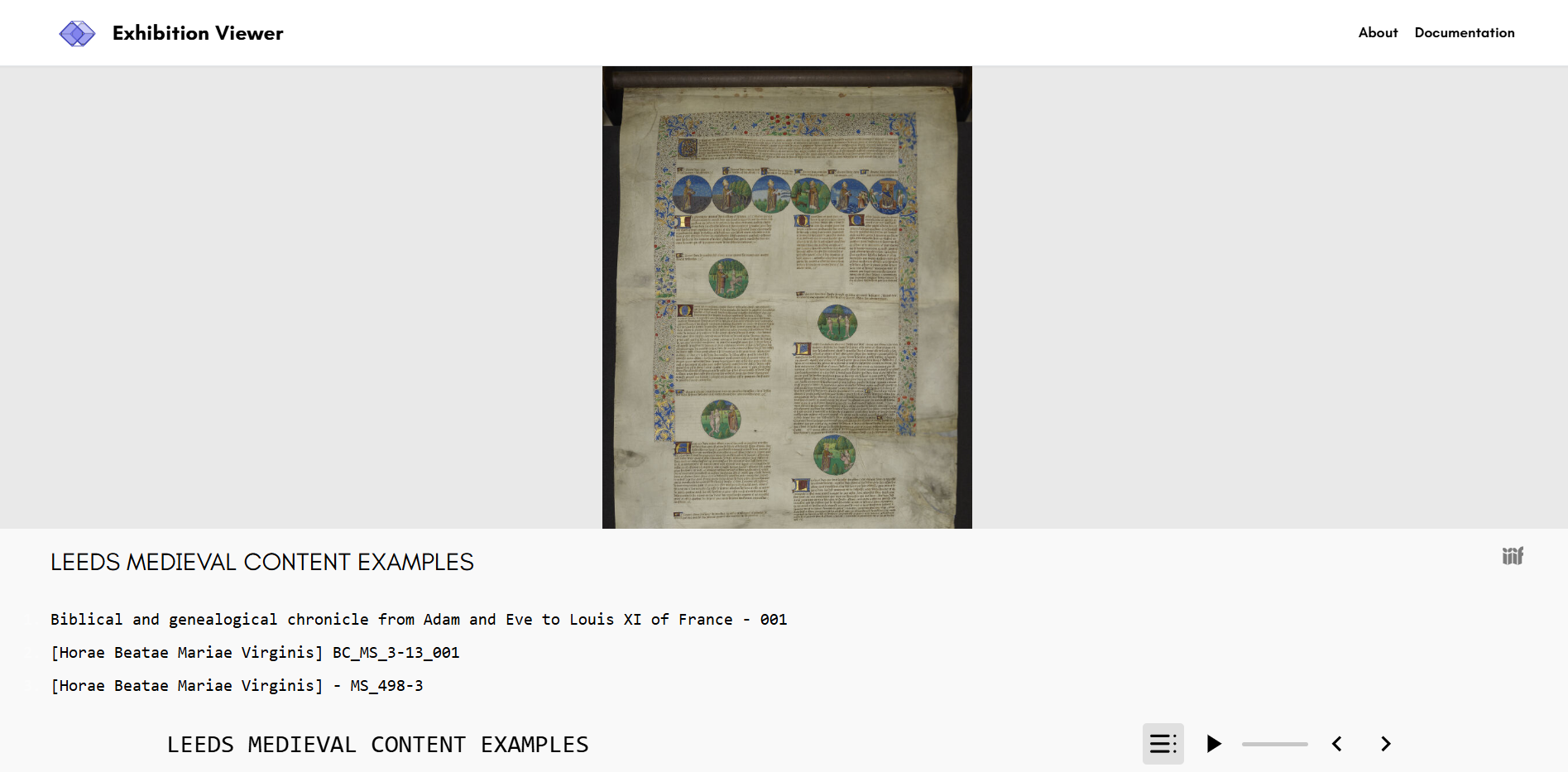
- Select the ‘Floating tour’ option, which will open your Manifest in the Exhibition Viewer.
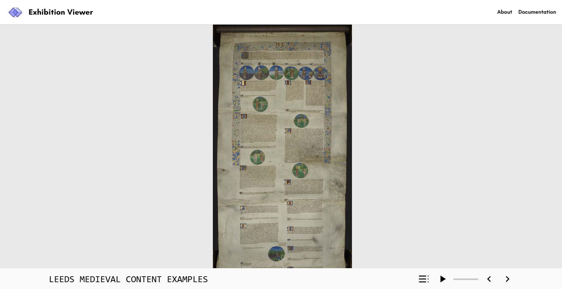
- Use the Exhibition Viewer controls to view your tour.
- You can continue to edit and update your exhibition manifest, and preview your changes as you make them.
Exhibition layout options
Section titled “Exhibition layout options”The following are the currently configured, exhibition layout options that you can select and preview your Exhibition Manifest in.
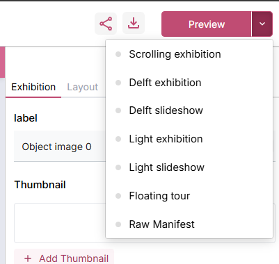
Delft exhibition
Section titled “Delft exhibition”This is the standard full page layout for Delft exhibitions. If you want to view some of their examples, see the list below which showcase the layout and how different layout options for the text and assets are used.
https://heritage.tudelft.nl/en/exhibitions/irrigation-knowledge - Irrigation Knowledge https://heritage.tudelft.nl/en/exhibitions/novieten - Novices https://heritage.tudelft.nl/en/exhibitions/gen-ai - GenAI - example of a non heritage focussed exhibition
Colours, fonts and layout are Delft specific.
Delft slideshow
Section titled “Delft slideshow”This is presentation view of the Delft exhibitions. This is the same view that is launched when you select the ‘play’ option on the standard full page layout.
Colours, fonts and layout are Delft specific.
Light exhibition
Section titled “Light exhibition”A simple, clean standard full page layout for exhibitions. It differs from the Delft template with different colours, fonts and layout.
Light slideshow
Section titled “Light slideshow”This is presentation view of the Light exhibition. This is the same view that is launched when you select the ‘play’ option on the standard full page layout.
Floating tour
Section titled “Floating tour”A floating modal based version of the light exhibition presentation view. Enables the display of tour steps using different positional behaviours for the floating modals.
Scrolling exhibition
Section titled “Scrolling exhibition”An immersive scrolling experience with sticky images and floating/split text overlays. Smoothly transitions between tour steps in a deep zoom viewer, and is suitable for single image exhibitions with lots of annotations or tour steps.
Exhibition editor controls
Section titled “Exhibition editor controls”These controls apply to individual Canvases within your exhibition manifest. If you open an existing IIIF Manifest or the Manifest you created in the previous activity, it will require some basic Exhibition settings to applied (as noted in Step 4 above). When you select the ‘Apply defaults’ option for your exhibition slides (Canvases) this applys some basic settings to the slide content which determines how it is presented in the Exhibition Viewer.
When you navigate to the ‘Layout’ tab, you’ll notice what has been applied:
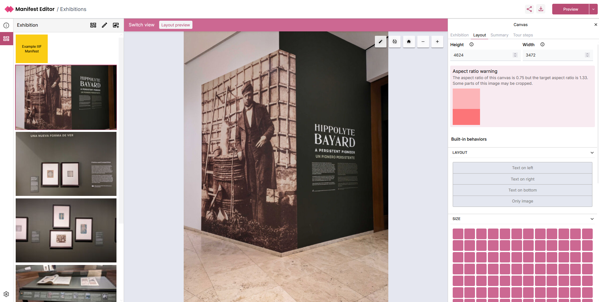
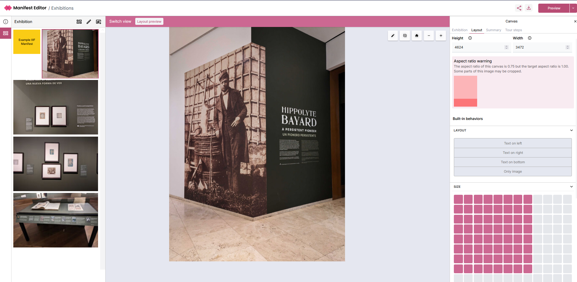
Aspect ratio
Section titled “Aspect ratio”This will indicate a warning if applicable. You can use the ‘Size’ option to adjust the image appropriately and assess how well your changes apply to your selected content.
As you alter the size, you’ll see how the changes impact the exhibition layout in the left hand exhibition grid:
Behaviours
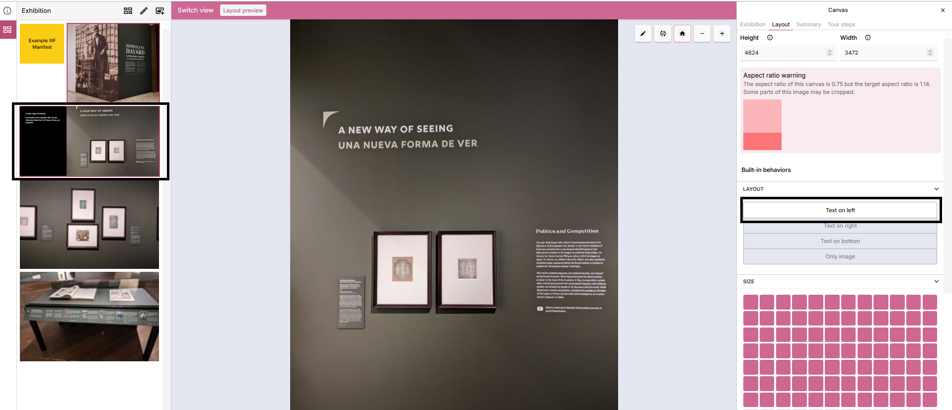
Section titled “Behaviours”There are a number of layout behaviours that are available which can be applied to your slides. These determine how to present the slide (Canvas) Summary information presented on the ‘Summary’ tab in the right hand panel, when viewing the exhibition manifest in the standalone Exhibition Viewer.
In the example below, ‘Text on left’ is selected which will result in the Label and Summary text being presented in a text component next to the image within the Exhibition Viewer. The effect of this change can be partially previewed in the Grid view in the left hand panel:
Layout behaviours
Section titled “Layout behaviours”- Text on left - Text will appear on the left in a block, the image on the right.
- Text on right - Text will appear on the right in a block, the image on the left.
- Text on bottom - Text will appear on the bottom in a block, the image on the top.
- Text on top - Text will appear on the top in a block, the image on the bottom.
- Only image - Only the image will be displayed.
Floating behaviours
Section titled “Floating behaviours”In some variations you can have a floating variation, such as the slideshow. Instead of the text and summary taking up the whole side of an image, instead they float in a smaller box on top of the image.
The options for this are:
- Float top left - Text floats in a box in the top left
- Float top right - Text floats in a box in the top right
- Float bottom left - Text floats in a box in the bottom left
- Float bottom right - Text floats in a box in the bottom right
Size grid
Section titled “Size grid”For full page layouts you can choose how big an image is on a 12x12 grid. This allows you to position 2 or more canvases next to each other, or reduce the width of a canvas to better fit.
Other behaviours
Section titled “Other behaviours”You can add custom behaviours at the bottom of the layout tab. You can find a full reference of behaviours here.
Summary
Section titled “Summary”The ‘Summary’ tab presents the existing (Canvas) Label and Summary values if added for the current slide. This information can be presented as part of the exhibition, using the behaviour controls mentioned in the previous section.
These values can be edited and updated as needed.
Creating Canvas (aka Slide) with multiple images
Section titled “Creating Canvas (aka Slide) with multiple images”You may want to add multiple image(s) to a canvas as part of your manifest. This could be a collection of pages from a book or paper or a series of images that form part of your exhibition. As we saw in some of the examples of exhibitions from TU Delft, using this approach and navigating the user through those images is a great way to deliver a directed experience.
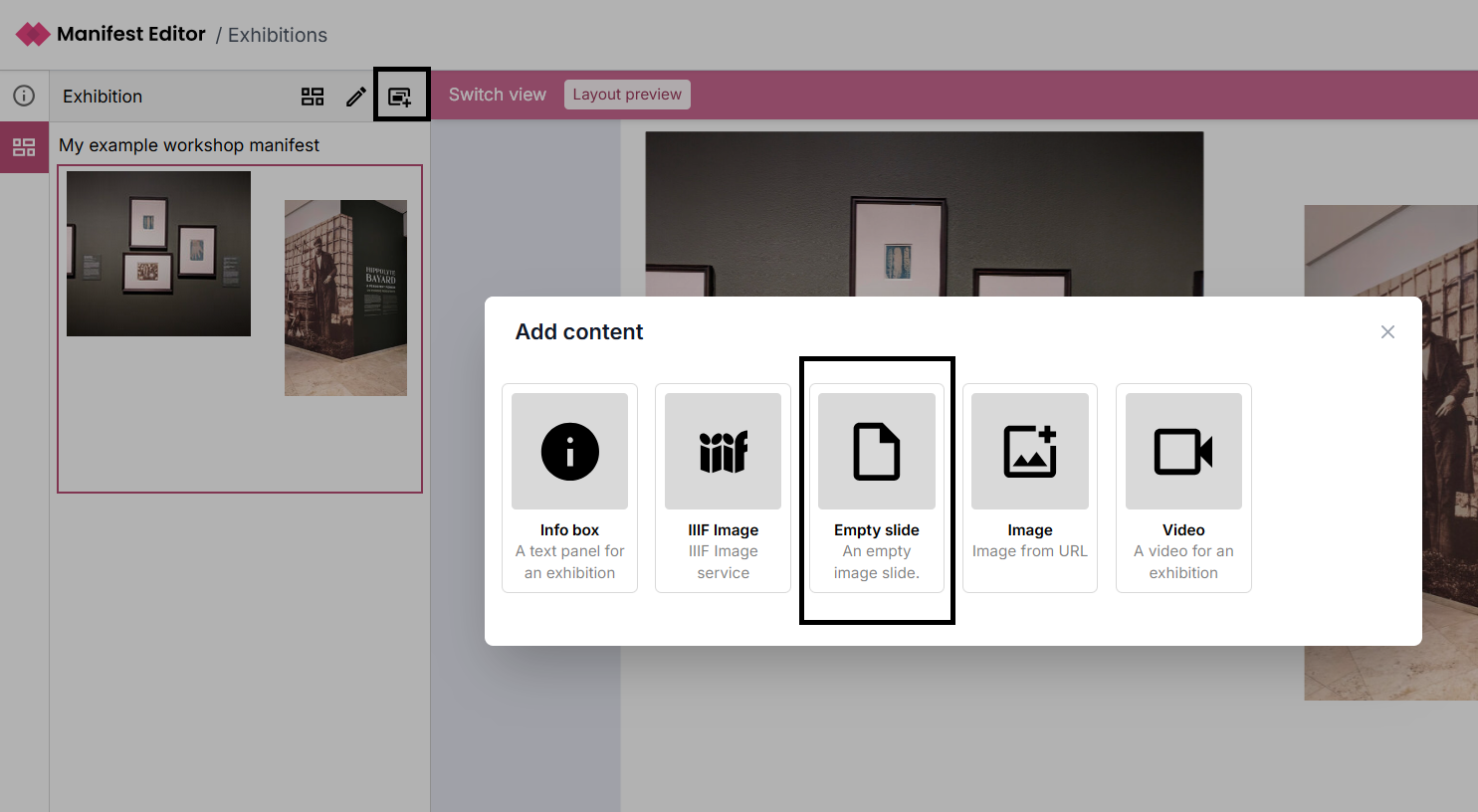
To do this, you can use the ‘Add new slide’ option in the left hand panel, and then select to add an “Empty slide”:
-
Add a label to your new slide (canvas) using the right hand side metadata panel - “Exhibition” tab.
-
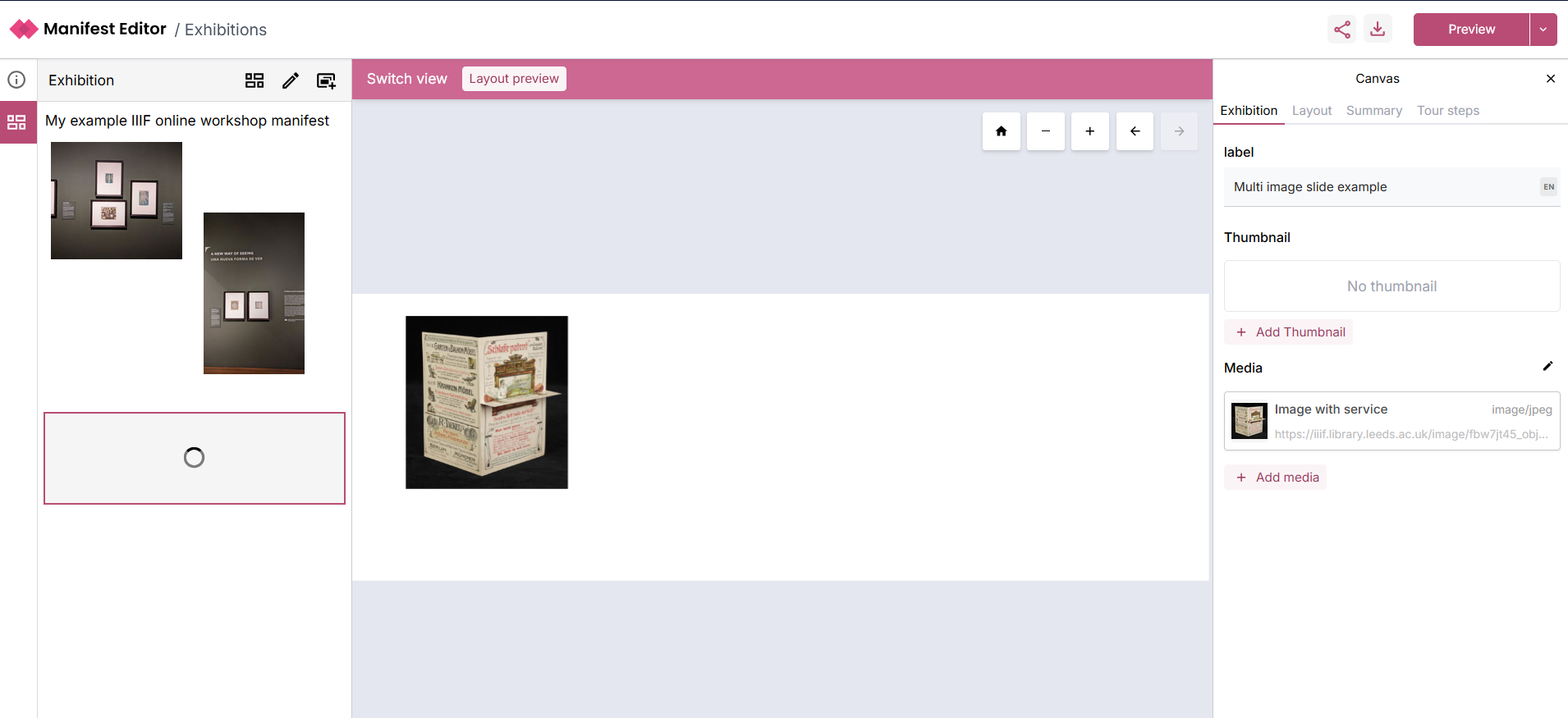
To add the first image, select the ‘+ Add media’ option in the right hand side Canvas metadata tab - “Exhibition” tab:
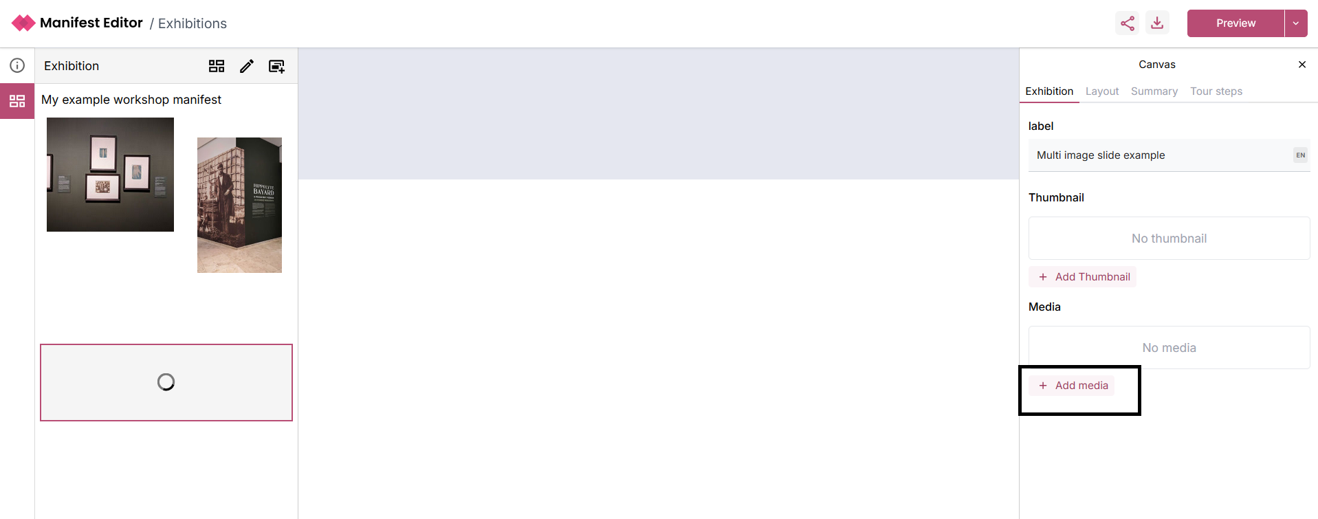
- Select the first image you wish to add, using the appropriate image option. Once you have selected the image, it will be loaded into the canvas as below:
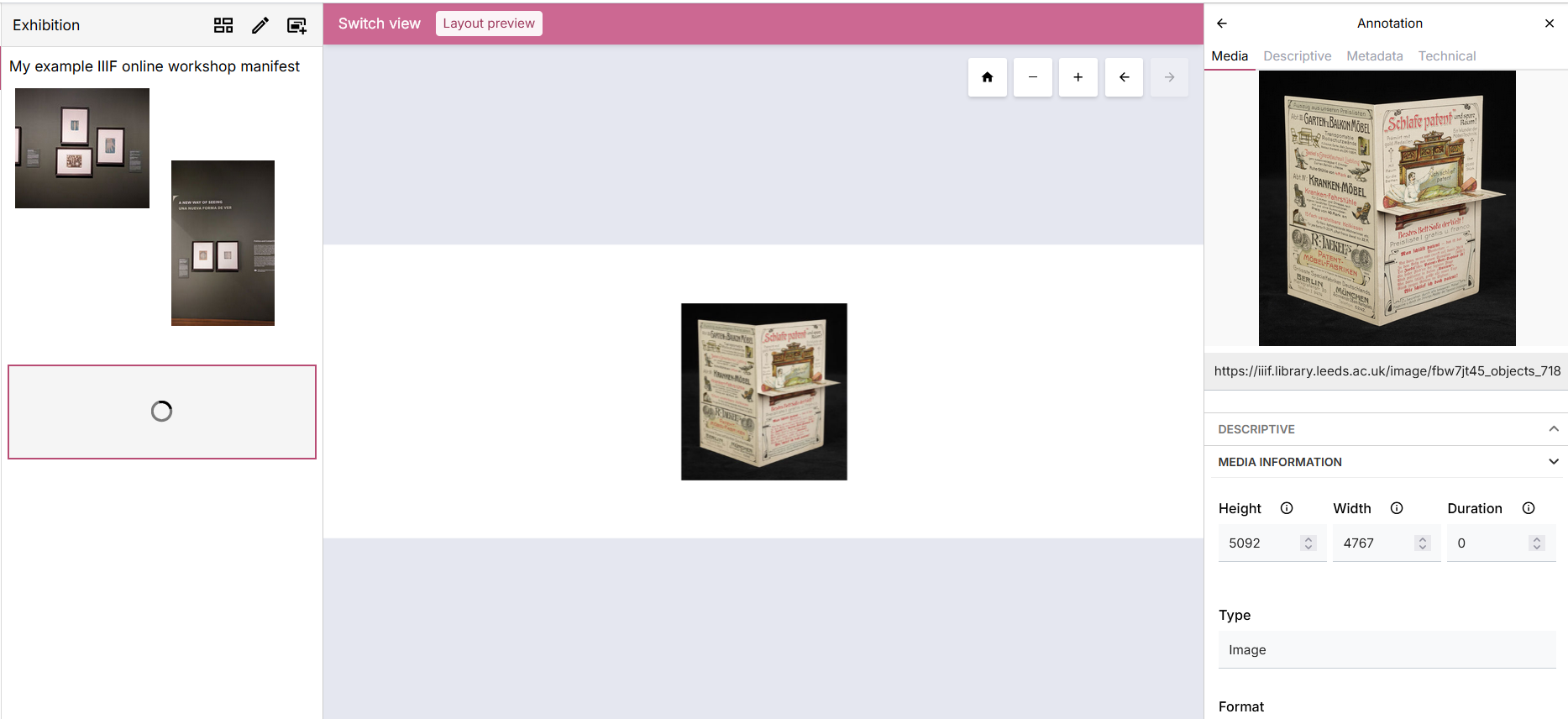
- In the right hand metadata panel for the newly added image, scroll to find the ‘Target’ for the selected image:
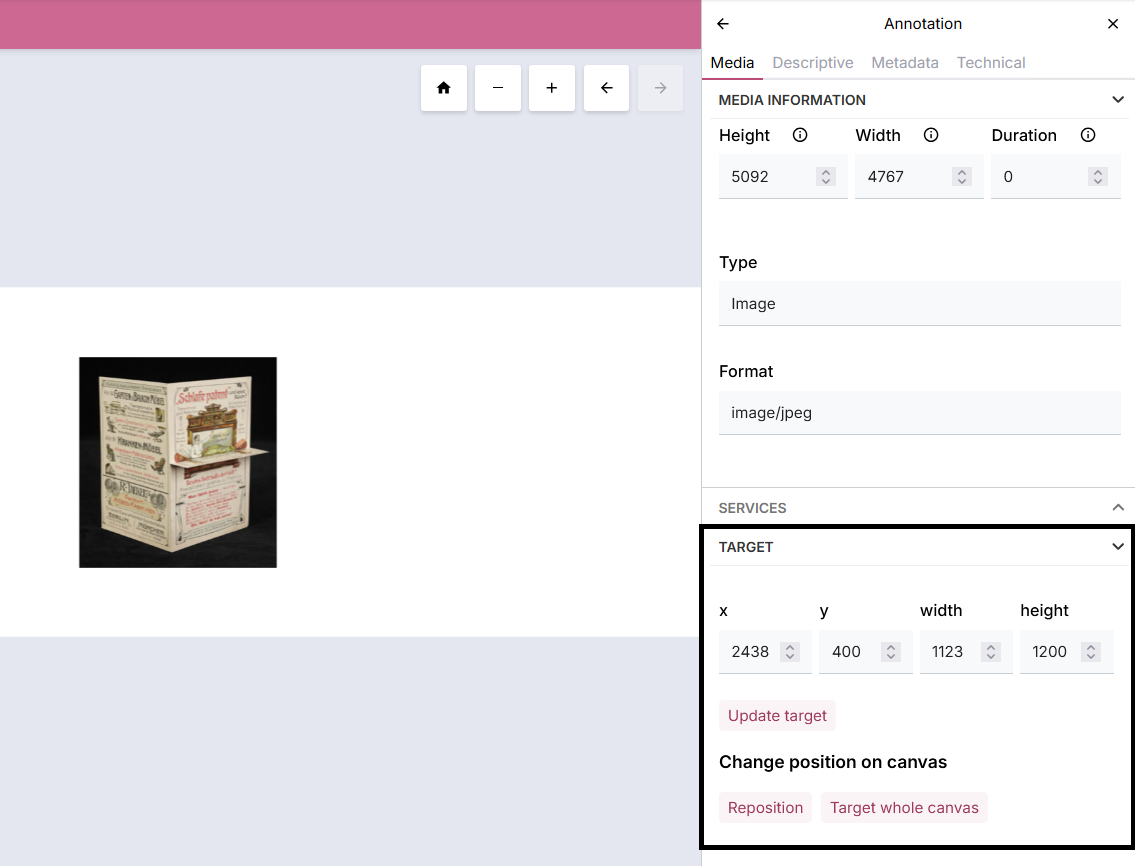
- Select the option to ‘Reposition’, which will enable you to move or resize the selected image as required. Select the ‘Finish editing’ once you have positioned the image appropriately.
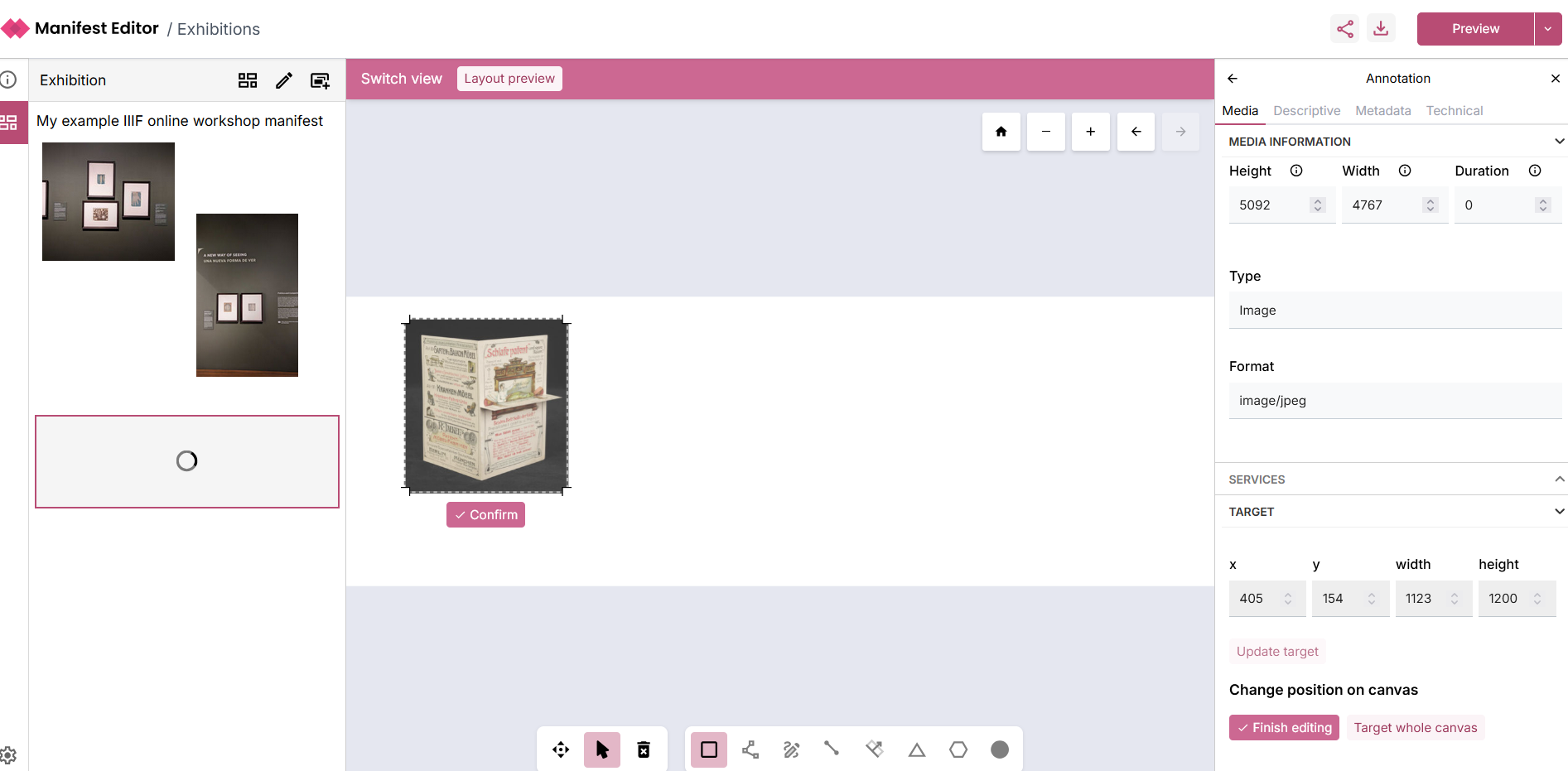
- You can then click on the canvas (slide) in the left panel or use the ‘Back’ arrow in the right hand panel to return to the ‘Exhibition’ tab:
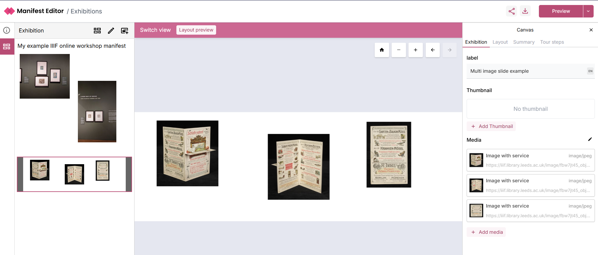
- To add another image to the Canvas, click on the ‘+ Add media’ option, and select the image you want to add, using the appropriate option. Repeating the steps above, you can use the Target options including ‘Reposition’ the to resize and move the selected image as required.
Adding a tour of your multi-image canvas (slide)
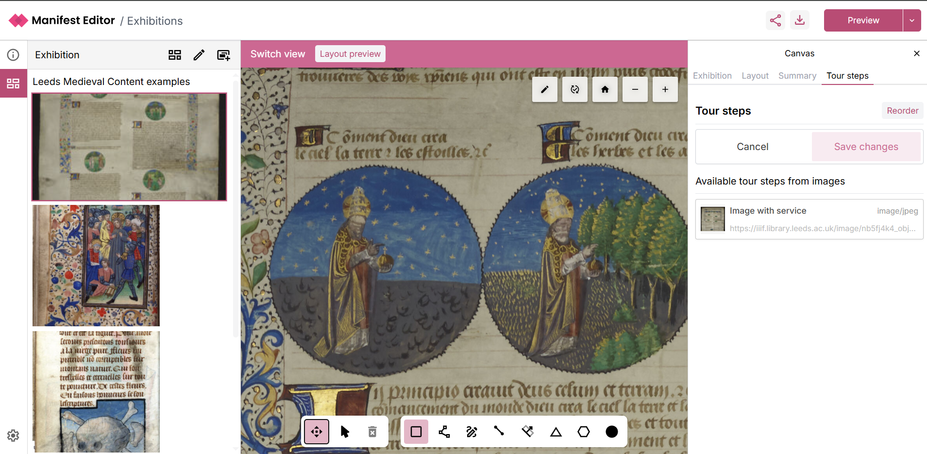
Section titled “Adding a tour of your multi-image canvas (slide)”Now that you’ve created a multi-image canvas you may want to use the ‘Tour steps’ to enable your exhibition to direct users to each image, and present some information for them about those images.
Continuing from the previous section, you can select the ‘Tour steps’ tab for this canvas:
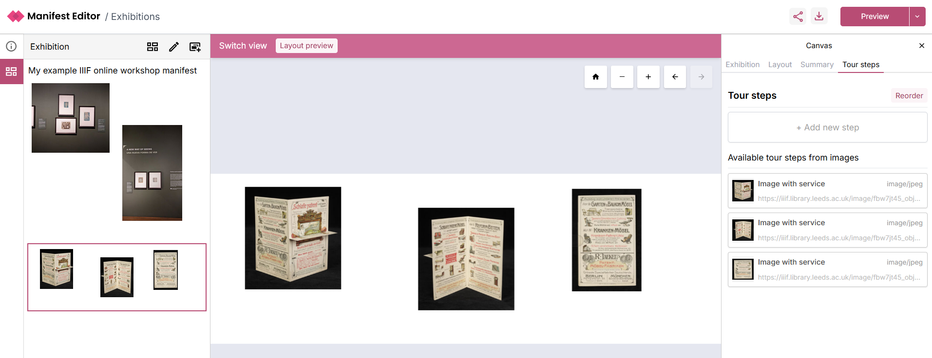
- Select each image from the ‘Available tour steps from images’ list - you can then add an content using the ‘Edit body’ for each step:
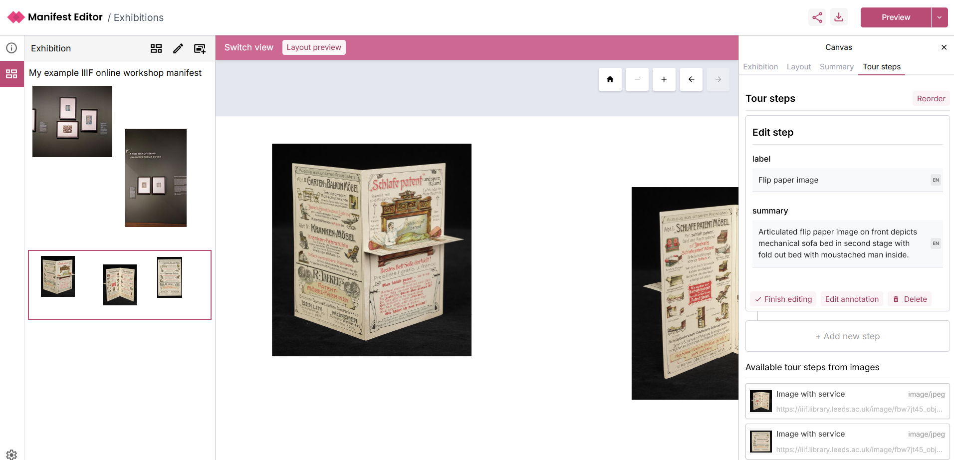
- Once you have added all your steps, you reorder or update as required.
- You can then preview your exhibition manifest using one of the Exhibition Viewer layout options, for example: